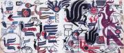
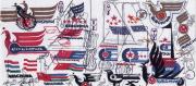
1988年,韩美林先生和郑天石先生共同为中国国际航空公司设计的航徽标志正式启用。韩美林经过七十多次修改后设计的标志为一只美丽的凤凰,其设计灵感源于晋宁石寨山出土的西汉中期的青铜凤形拐杖头。凤凰自古以来是美丽高贵的象征,她昭示着吉祥,昭示着美好,昭示着和谐。《山海经》中曾记述:“凤凰出于东方君子国,飞跃巍峨的昆仑山,翱翔于四海之外,飞到哪里就给哪里带来吉祥和安宁。”以凤凰作为航徽既传承国航民族企业“旅客至上”的理念,也符合航空业“安全服务世界、创新导航未来”的企业精神。标志的图案颜色设定为喜庆的中国红,传达着热烈、吉祥、幸福、美满与和谐的寓意,尽显中国东方文化之底蕴。凤凰飞起,承载着人们到全世界每一个幸福快乐之地的美好祝愿。
The logo of Air China was co-designed by Mr. Han Meilin and Mr. Zheng Tianshi in 1988. Having revised it for more than 70 times, Mr. Han Meilin finally design on a beautiful phoenix. His inspiration came from the head of a Han Dynasty (206BC-220AD) bronze-stick unearthed in Jinning’s Shizhai Mountain of Yunnan. A number of parallel lines have been turned into a graceful “phoenix”. In China, the phoenix symbolizes beauty and auspiciousness, happiness and harmony. It is describes in an ancient Chinese book - Legends of Mountains and Seas, “The phoenix was born in the orient. It soars over the majesty Kunlun Mountains and flies throughout the entire world. Wherever it flies, the residents are blessed with peace and good fortune. ” This logo can also be seen as three letters “VIP”, expressing Air China’s concept of “Passengers First” and conforming to the aviation industry’s enterprise spirit—“Serve the world in safety, lead the future with innovation”. The color of Chinese red symbolizes warmth, auspiciousness, happiness and harmony, which aptly indicates China’s culture. Wherever the phoenix flies, it brings the beautiful wishes to every corner of the world.